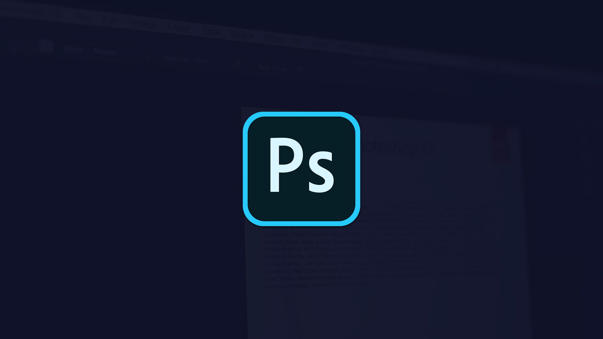
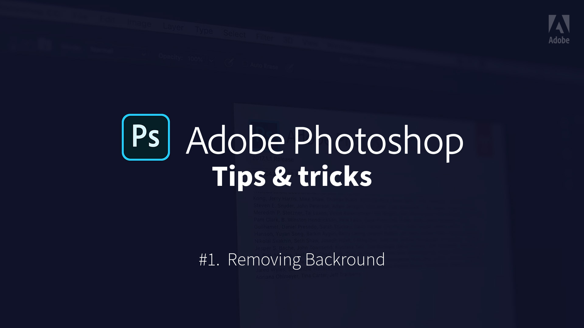
You can see below the direction for the Look and Feel of the Start / End screen and also lower-third for the Adobe App videos. Each video will follow the same layout. Colours will differ from an App to another. (Blue for Photoshop, Orange for Illustrator, etc. ).
Each Start screen will have a background video of the interface being manipulated for an illustrative purpose. The first screen will be wrapped up in around 5 sec.
This look and feel is minimalist and keeps the consistency with the Adobe brand video tutorial that has been shared with me.
1 – Introducing the App in center screen on the App colour background with video background
2 -The App logo animate to reveal the name

3 -The sub lines appears
Speaker
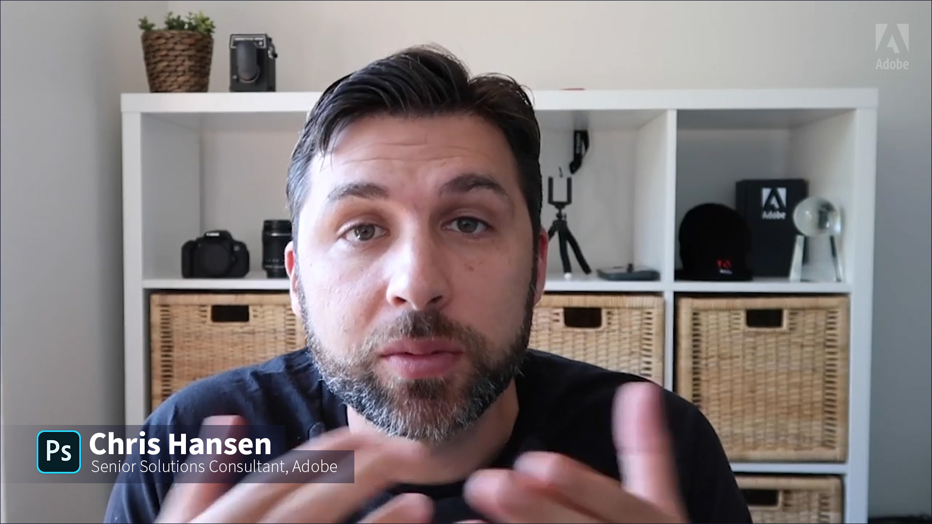
Can be following the Start screen like one of the Adobe reference or being a lower third on the actual speaker.
(note: the Adobe logo could be present in the top right corner as a Watermark on all the videos)

Quick Example of Motion direction
(place holder video background that i recorded – Also music from one of the reference)
End Screen
Will fade to the App Colour background with the correct link.
The App logo will animates in for couple second before animating into the Adobe logo on Black background